I have used the WPTouch Pro WordPress plug-in to give this web site a mobile theme. It is not an elegant solution. I am actually a little disappointed in the “pro” version of this plug-in as the iPad component is buggy and simply not working consistently. I have not implemented the iPad theme at this stage as a result. I would recommend that you use the free version in the meantime.
This plug-in works a little better with the iPhone. Configuring the menus for the mobile theme can result in a human computer interface nightmare for the end-user so I decided to keep the menus as simple as possible.
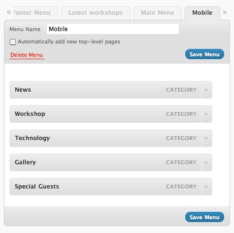
I based the menus for the mobile theme entirely on categories. I set up a menu in WordPress and titled it Mobile. I added five categories to that new menu. They are as follows:
- News: all blog posts ~ labelled News
- Workshops: posts concerning my technology workshops ~ labelled Workshop
- Tools: all posts that dealt with specific technology tools ~ labelled Technology
- Photography: all posts that feature photo galleries ~ labelled Gallery
- Friday-Follow: the weekly interviews with special guests ~ labelled Special Guests

I then selected the new Mobile menu within the WPTouch Pro settings window. You can see the setting below. This will be the menu that shall appear within the mobile interface on the iPhone.
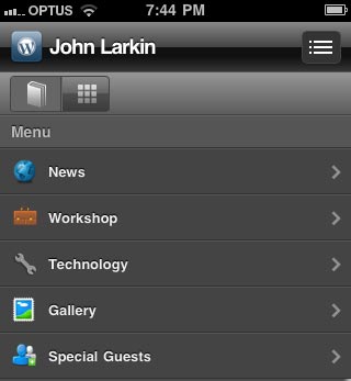
I also allocated a range of icons to each menu item within the WPTouch Pro settings window. I gave each menu items its own particular icon naturally. WPTouch has a rich array of icons to draw from. This is a very good feature.
![]() I saved the settings and I cleared the caches using W3 Total Cache as well as clearing the Safari cache on the iPhone.
I saved the settings and I cleared the caches using W3 Total Cache as well as clearing the Safari cache on the iPhone.
The category driven menu will appear as follows if the iPhone user selects the menu icon at the top right hand of of the screen.

The end user can easily navigate to key components of the site. I added the site to the “Home Screen” on my iPhone so now it has its own specific icon. A neat feature of WPTouch allows you to create a splash screen for the “web-app” and I created a splash screen that is similar to the home page for this web site. It appears below. Hope you do not think is is too melodramatic. I created it using Flare and Photoshop Elements. Flare is a really cool app.
I also created a splash screen for the iPad however I shall have to wait for some bugs to be fixed, on the iPad apparently, before that can be implemented.
When the user selects a post to read using the iPhone it appears as below. The images are resized to fit the screen and the text is displayed in a suitably sized font. The post is easy to read. This is the original post.

Scrolling down the same post one can see that text and images are neatly laid out. I think this is quite good. Reading the original web site on the iPhone would be nigh on impossible unless you zoomed in and then you would have to drag around the screen: up, down and around.
There is one issue. From time to time the fonts screw up and the mobile site appears as below. It is unpredictable and a little frustrating to say the least. I can put up with it for the time being.

In the final analysis WPTouch is a very useful plugin and handles mobile devices other than the iPhone. I look forward to updates with the app and, in particular, the iPad component.
There is one other app that I am looking forward to… it is OnSwipe, formerly known as PadPressed. I understand that it will create a mobile interface for your site not unlike that of the remarkable iPad app, FlipBoard. That I would certainly like. Wouldn’t you?


Recent Comments